Paul Rand: Defining Design
By Staff on Nov 13, 2013
The Museum of Design Atlanta is currently hosting “Paul Rand: Defining Design,” an exhibit examining the design legend’s career. We had the chance to talk with Daniel Lewandowski, the exhibition’s curator and creator of Paul-Rand.com to glimpse his understanding of the icon, as well as insight on what modern advertisers and designers can take from his work.
How did this exhibition come about?
It really all started when I began building the website paul-rand.com in 2005. It was out of frustration with lack of more information about Mr. Rand that inspired me to build it and has been a labor of love done entirely on my own time between projects. In 2011, I was at a photo shoot for Delta Air Lines in Minneapolis, MN which happened to be the opening night for Michael Skjei’s exhibit “bRANDs: The Early Years,” which focused on Rand’s early logo and character development. Michael and I became fast friends and thought it would be a great idea to bring something like this to Atlanta.
So I approached MODA with idea and they were intrigued. We spoke at length about Rand’s contributions to the field of graphic design and, in particular, his writings about the subject. This was a unique approach to exploring his work because he wrote very clearly and concisely about topics such as typography, color, form and content, repetition and humor. This also matched up quite well with MODA’s goals of educating and inspiring their visitors. So we began working towards bringing it to life. The staff and I worked closely to figure out exactly what the overall experience would be and how visitors would flow from one room to another.
Overall it has been a huge success for MODA and the Atlanta design community and I couldn’t have been more proud of the outcome and thankful to everyone involved to make it happen.
How is Rand's work still relevant today?
Rand’s visual work will always be relevant because it was done with the utmost attention to craft paired with a deep understanding of aesthetic principles that have informed artists, poets, sculptors and the like for eons. He recognized that there was no artistic difference between a painting and a poster as long as it was done with quality and used those same principles to create a compelling image. He believed that art, no matter what form, was the synthesis of form and content. His writing is just as important in that it explains quite clearly his beliefs about those same principles that informed his work.
I believe that is one of the main reasons he was able to be so successful in his career. He was able to find inspiration around him but interpret it in his own unique way. Publishing on the topic using his own work solidified his position.
What can advertisers take from this exhibition?
Anyone who is in a creative field can walk away with the sense that design is everywhere in our life. No matter what the problem may be, whether it’s interesting to you or not, you can still solve it with creative combinations of those same aesthetic principles. You just have to figure out your own way of using them and how you define “design” for yourself. Along with the fact that a brand doesn’t have to be doggedly consistent in everything they do. A bit of freedom and flexibility goes a long way to give a brand some personality.
How did Rand influence the aesthetics of logos?
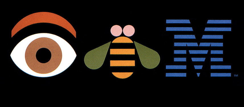
Rand was doing logos before they were called logos; before the term “branding” existed. His early characters are some prime examples of branding and visual flexibility at its finest. His work for El Producto is great example of taking an ordinary cigar, infusing it with human qualities, and creating a memorable image that customers were always delighted to see. If you compare his later work, and what he’s most known for, to those early campaigns, you’ll see a consistent thread—that belief of form fusing with content around a unique idea.
One interesting element about his logo development was his presentation books given to clients. By themselves, they are fantastic lessons in typography, color, form, symbolism and concept. They walked clients through his thought process, which helped them understand why certain decisions were made. His booklet for Steve Jobs’ NeXT is his most famous, but there were others much earlier and just as well written. We were lucky enough to have all but one, Frigiking, in the exhibit.
Besides the fact that he was able to distill his designs down to simple, geometric forms (and you can’t really argue with geometry) these books, I believe, heavily influenced how logos are presented today.
How is the design world different because of Rand?
Many people may not realize this, but the Art Director/Copywriter team really started with Paul Rand and Bill Bernbach. Their collaboration while at the Weintraub Agency set the standard for how we work today. Rand respected and valued the work of a good copywriter and they were able to single-handedly change the agency model forever.
Rand was always striving to do what he called “good work”. He wasn’t trying to be original or groundbreaking, he was just doing what he thought was best with the combination of a good idea and unique visual interpretations. One of the biggest things we can all take away from Rand is that no matter how mundane or boring you think a subject may be, there is always a unique solution. It just depends on how hard you want to work to find it.
How did this exhibition come about?
It really all started when I began building the website paul-rand.com in 2005. It was out of frustration with lack of more information about Mr. Rand that inspired me to build it and has been a labor of love done entirely on my own time between projects. In 2011, I was at a photo shoot for Delta Air Lines in Minneapolis, MN which happened to be the opening night for Michael Skjei’s exhibit “bRANDs: The Early Years,” which focused on Rand’s early logo and character development. Michael and I became fast friends and thought it would be a great idea to bring something like this to Atlanta.
So I approached MODA with idea and they were intrigued. We spoke at length about Rand’s contributions to the field of graphic design and, in particular, his writings about the subject. This was a unique approach to exploring his work because he wrote very clearly and concisely about topics such as typography, color, form and content, repetition and humor. This also matched up quite well with MODA’s goals of educating and inspiring their visitors. So we began working towards bringing it to life. The staff and I worked closely to figure out exactly what the overall experience would be and how visitors would flow from one room to another.
Overall it has been a huge success for MODA and the Atlanta design community and I couldn’t have been more proud of the outcome and thankful to everyone involved to make it happen.
How is Rand's work still relevant today?
Rand’s visual work will always be relevant because it was done with the utmost attention to craft paired with a deep understanding of aesthetic principles that have informed artists, poets, sculptors and the like for eons. He recognized that there was no artistic difference between a painting and a poster as long as it was done with quality and used those same principles to create a compelling image. He believed that art, no matter what form, was the synthesis of form and content. His writing is just as important in that it explains quite clearly his beliefs about those same principles that informed his work.
I believe that is one of the main reasons he was able to be so successful in his career. He was able to find inspiration around him but interpret it in his own unique way. Publishing on the topic using his own work solidified his position.
What can advertisers take from this exhibition?
Anyone who is in a creative field can walk away with the sense that design is everywhere in our life. No matter what the problem may be, whether it’s interesting to you or not, you can still solve it with creative combinations of those same aesthetic principles. You just have to figure out your own way of using them and how you define “design” for yourself. Along with the fact that a brand doesn’t have to be doggedly consistent in everything they do. A bit of freedom and flexibility goes a long way to give a brand some personality.
How did Rand influence the aesthetics of logos?
Rand was doing logos before they were called logos; before the term “branding” existed. His early characters are some prime examples of branding and visual flexibility at its finest. His work for El Producto is great example of taking an ordinary cigar, infusing it with human qualities, and creating a memorable image that customers were always delighted to see. If you compare his later work, and what he’s most known for, to those early campaigns, you’ll see a consistent thread—that belief of form fusing with content around a unique idea.
One interesting element about his logo development was his presentation books given to clients. By themselves, they are fantastic lessons in typography, color, form, symbolism and concept. They walked clients through his thought process, which helped them understand why certain decisions were made. His booklet for Steve Jobs’ NeXT is his most famous, but there were others much earlier and just as well written. We were lucky enough to have all but one, Frigiking, in the exhibit.
Besides the fact that he was able to distill his designs down to simple, geometric forms (and you can’t really argue with geometry) these books, I believe, heavily influenced how logos are presented today.
How is the design world different because of Rand?
Many people may not realize this, but the Art Director/Copywriter team really started with Paul Rand and Bill Bernbach. Their collaboration while at the Weintraub Agency set the standard for how we work today. Rand respected and valued the work of a good copywriter and they were able to single-handedly change the agency model forever.
Rand was always striving to do what he called “good work”. He wasn’t trying to be original or groundbreaking, he was just doing what he thought was best with the combination of a good idea and unique visual interpretations. One of the biggest things we can all take away from Rand is that no matter how mundane or boring you think a subject may be, there is always a unique solution. It just depends on how hard you want to work to find it.


Related

The Man Who Made Art His Weapon
The story of legendary photographer Gordon Parks
Once Upon A Time, Dan Wieden
An annotated elegy courtesy of the icon’s first copywriting hire

Teagan Talks Transitioning
Discussing transgender identity in depth with our Education Manager at The One Club for Creativity
Dondre Green: A Bronx Tale
One Club Member shares his photo experience with us